Visual Artifacts in Data Analysis

It’s difficult to overestimate the value of visualization in data analysis. Visual representations of data should not be considered the results of an analysis process, but rather the essential tools and methods that should be applied at every stage of working with data. When dealing with specific data and questions, we often find it useful to add non-standard visual elements that are adapted to characteristics of the data, goals of analysis tasks or individual and organizational requirements. We refer to such new elements as analysis artifacts, which can be defined as visual products of analysis methods, general or specific for domain and scenario, providing additional context for the results or the analysis process. There may be various goals identified for specific analysis artifacts, but their general role is to make the analysis user experience more accessible, adaptable and available.

Analysis artifacts can take many forms, from text elements, through supplementary data series, to new custom shapes and visual constructs. The simplest example are contextual text annotations, often automatically added, with details regarding the data or the process (see example). Some analysis artifacts are generic as they address data properties, like the cyclical or seasonal nature of a time series, patterns and trends (e.g. rent case study), outliers and anomalies or differences and similarities against population data. Some others are specific for a domain and/or type of an analysis task, and may be closely integrated with methods implemented in related analysis templates. In practice, we can think about different types of analysis artifacts in terms of tasks used in analysis decision support

  • SUMMARIZE the structure and quality of data, results of analysis or execution of the process
  • EXPLAIN applied analysis methods, identified patterns, trends or other interesting discoveries
  • GUIDE through the next available and recommended steps at given point of the analysis process
  • INTEGRATE the data from different sources and the results from different methods and agents
  • RELATE the results, data points, data series, big picture context, and input from different users
  • EXPLORE anomalies, changes, hypothesizes and opportunities for experimentation or side questions

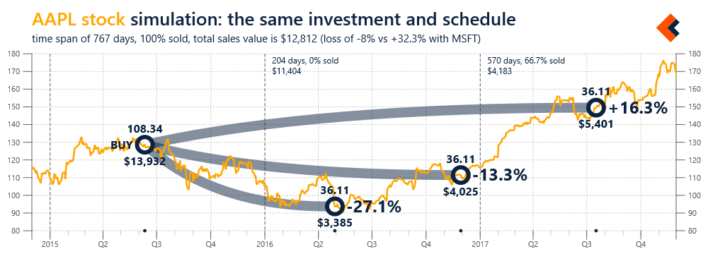
Figure 1 includes an example of domain and scenario specific analysis artifact (INTEGRATE type) for stock market transactions. This artifact illustrates a single purchase of stock and subsequent sales, using historical quotes as the background. For each sale event, the information about number of sold stock, their value and gain/loss are included.

Figure 1. Analysis artifact for stock transactions, with a single purchase and multiple sales events (SVG)

Figure 1. Analysis artifact for stock transactions, with a single purchase and multiple sales events (SVG)

Analysis artifacts can be considered means for adaptation of analysis experience to the context of analysis tasks and user’s needs, requirements and preferences. They can be highly customized and personalized, leading to adaptive user experiences that are more effective and efficient in the scope of controlling the analysis processes and interpreting the results. These capabilities make analysis artifacts very powerful tools for complex decision problems and situations. They can be very useful in dealing with imperfect data, potential information overflow, operating under strong external requirements (e.g. time constraints) or in configurations with multiple participants and incompatible goals and priorities. We found that they can be also helpful beyond visualization, as the artifact-related data structures can become subjects of analysis or be applied in a completely different scope or a different scenario.

For example, Figure 2 presents a simple simulation based on the analysis artifact presented in Figure 1. The data structure related to that artifact are used here to illustrate a hypothetical scenario of investing the same amount of money in a different stock and following the same exact sales schedule (selling the same percentage of stock at each time point).

Figure 2. Simulation of the purchase and sell transactions from Figure 1 applied to a different stock (SVG, 2, 3)

Figure 2. Simulation of the purchase and sell transactions from Figure 1 applied to a different stock (SVG, 2, 3)

We think about visualization of our data as merely a canvas upon which we can paint specialized and personalized artifacts from our analysis processes. These artifacts can be applied not only in the scope of individual charts, but also for interactive decision workflows, based on multiple data sources, that may require many integrated visualizations in order to provide a sufficient context for a decision maker. This is especially important for data analysis in social context, with advanced collaboration scenarios involving multiple human participants and AI agents. As the complexity of algorithms and models is increasing, we need to provide significantly more user-friendly analysis environments for expanding number and variety of users. Multimodal interactions and technologies for virtual or mixed reality have great potential, but the best way to deal with complexity is to focus on simplicity. Analysis artifacts seem to be natural approach to that challenge and they should lead us to brand new types of data analysis experiences, which may soon be necessities, not just opportunities.
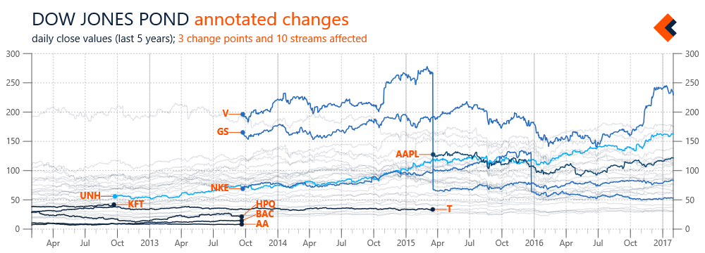
Visual Decision Support

In this blog post, we'll use examples from the first prototype that was implemented at Salient Works - the set of libraries and applications for decision support in air traveling scenarios. The primary motivation for that project was to address challenges related to long distance air travel, which can be very stressful, even when everything is going according to plan. They usually start with selecting a connection, when a traveler may experience information overload as different options are difficult to compare. During a trip, transfers between flights can be especially overwhelming due to time zones, unfamiliar airports and overall travel fatigue. In that context any unexpected event, like a missed or cancelled flight, can be traumatic, especially for elder or less frequent flyers. Many of these factors cannot be controlled, but we can build technical solutions to keep users comfortably informed, assist them at critical points and facilitate their interactions with other entities (like airlines).

Such solutions require effective presentation of information, usually in a visual form (though other types of interfaces can be also applied). We plan to publish a dedicated post about visualization as an essential part of data analysis, but here we’d like to talk about a more specific scope – role of visualization in decision support. We refer to visual decision support to describe situations when the user experience in a decision scenario is built around a visualization pattern specifically designed to address requirements of this scenario, with all its context and constraints. In practice, it means that all information required to make a correct decision, or series of decisions, should be delivered to a user at the right time and in the form adapted to user’s situation and most probable cognitive state. In our prototype applications, the relevant information is mostly related to time and space orientation and it should be presented in a way that reduces probability of errors (e.g. caused by lack of sleep) and stress related to operating in an unknown environment.

Let’s move to specific examples from our prototype. The main idea was to design a simple and universal visualization pattern that could be consistently used throughout different stages of a travel experience, including planning, the actual trip and dealing with emergencies. An example visualization of a trip between Seattle and Poznan using this pattern is presented in Figure 1. The pattern is built around time as perceived by the traveler (horizontal axis) and we placed a special emphasis on critical time points like beginning of each trip segment, as well as translating time zone differences upon arrival at a destination. The grayed area in the background indicates night time, so it should be easier for a traveler to plan working and resting during a trip. Creating such a visualization is the first step, as it can be customized and personalized (also for accessibility), used in a static itinerary (see example from our prototype) or in a dynamic companion application and updated with current details, such as a departure gate.

Figure 1. An example visualization if a trip between Seattle and Poznan

Figure 1. An example visualization if a trip between Seattle and Poznan

One key property of this pattern that may not be immediately obvious is the dimension of vertical axis - in the configuration of our examples it is based on latitude of visited airports. This property was introduced in order to create unique shapes for different trip options and to make a selected one look familiar and recognizable. After all, the same visual representation is about to be used during different stages of a trip, starting with its planning. This is actually the stage when the uniqueness of shapes turned out to be the most useful since it made comparison of available options much simpler and cleaner. Figure 2 contains examples of 5 different options for a trip from Seattle to Paris. As you can see, they are all presented using the same time range, so they are much easier to compare, including departure and arrival times, as well as layovers’ durations. We conducted limited usability tests and found out that this approach works also for comparing a significant number of options (see multiple results for the same query), especially when combined with multistage selection. Using our visual pattern, we were able to build a fully visual experience for trip searching, comparing and selection.

Figure 2. Comparison of 5 different options for a trip from Seattle to Paris

Figure 2. Comparison of 5 different options for a trip from Seattle to Paris

This was our first big project at Salient Works and we spent way too much time on its design and prototyping. In addition to core and support libraries, we built a visual search portal (integrated with Google QPX), functionality for generating personalized itineraries and even a proof of concept for a contextual app with a demo for re-scheduling a missed or cancelled connection. Unfortunately, we were not able to establish working monetization scenarios or find partners to introduce our prototypes into production. But we gained a lot of experience, which we later used in development of our framework, where we implement concept of visual decision support in a more flexible way, through application of analysis artifacts associated with different domain libraries and templates. And our prototypes may still find their way into production environments, as we recently came back to the project and adapted this pattern to visualization of flight time limitations, with pilots and other flying personal as intended users.

Playing in the data pond

While talking about multiple data streams in the earlier posts of this series, we started using a term “data pond”. This is a concept we’re using internally in the context processing sets of streams, of the same or different types, that are usually somehow related - by source (e.g. a specific user or organization), domain (e.g. records from different patients) or processing requirements (e.g. data cannot be stored in cloud). Data ponds are very useful for simplification of data management, for example, in a basic scenario, adding a new stream to a project may require only dropping a file at a specific location. They are however also essential for analysis templates - sequences of transformations and analysis methods (generic or domain specific) that can be applied to streams in a pond.

Figure 1 illustrates an example of streams automatically added to, and removed from, a data pond. Again, we’re using streams with daily close prices of Dow Jones components. In this case, information about changing the stocks included in Dow Jones are added to a definition of the pond and our framework automatically includes appropriate data streams, with applicable time constraints (so we don’t have to directly edit streams). However, the scope of a pond doesn’t need to be predefined; it can be also automatically determined based on availability of data streams in associated data sources. Monitoring the state of a pond can be further expanded with custom rules (e.g. tracking updates’ frequency) that result in chart annotations or notifications from the framework.

Figure 1 Overview of changes in the list of Dow Jones components with automated change annotations (SVG)

Figure 1 Overview of changes in the list of Dow Jones components with automated change annotations (SVG)

Data ponds are not only useful for data management, they are also relevant for analysis templates, which can be executed on individual streams or on a data pond as a whole. Analysis templates can be applied by default during the importing phase, and include normalization, error detection or input validation. They may also be executed conditionally, based on specific events or the nature of data streams. For example, the prices in Figure 1 were not processed, and the changes due to stock splits are clearly visible (see V or NKE). A stream with information about such events was added to a pond’s definition and used to trigger a template for all affected stocks. The result is a new series with split adjusted prices calculated for use in a chart with percentage changes (Figure 2).

Figure 2 Example of an analysis template automatically applied to calculating split adjusted stock price (SVG)

Figure 2 Example of an analysis template automatically applied to calculating split adjusted stock price (SVG)

Data streams about Dow Jones components are obviously just a simple example, but this case study can be easily adopted to more practical applications like analysis of individual stock portfolio (with sells and buys defining the scope). We find data ponds, and visualizations based on them, useful in different scenarios and types of streams: records from multiple points of sale, results from repeated research experiments, and logs from hierarchically organized server nodes. Data ponds can be used to improve the management of input data, with detection of new streams and application of initial transformations, but also to give more control over the scope and context of a data analysis. This is especially important for long-term or continuous projects (e.g. building more complex models) and enables interesting scenarios like private analysis spaces, where specific requirements, including security, need to be met.

Foreground vs background

In the previous blog post we looked at the processing of multiple data streams and using the resulting sets of data (referred as data ponds) as subjects of data analysis. This is often an effective approach to help with understanding specific phenomena, as a big-picture created from a number of series can reveal trends and patterns. Such a big-picture can however serve additional purposes, as it also can be used to establish a relevant context for the processing of an individual stream (that may, but doesn’t have to, be part of the data used to create this context). The results from analysis templates implementing such an approach can be effectively visualized, with focus on the individual series as a clearly distinguished foreground and context from multiple series presented as a background.

In the examples below we again use Dow Jones components, this time with the 5-year history of their daily close prices. Figure 1 includes data series for all stocks in the scope of Dow Jones data pond, without any transformations applied and with focus on Microsoft (MSFT).

Figure 1. Five-year history of Dow Jones components with focus on Microsoft stock daily close prices (SVG)

Figure 1. Five-year history of Dow Jones components with focus on Microsoft stock daily close prices (SVG)

This chart is not very useful, since the value range of MSFT price is small compared to the value range of the chart (determined by all series) and thus the foreground series seems rather flat. This problem can be addressed by transforming all the series in the data pond, as illustrated in Figure 2, where series’ value ranges were normalized to [0, 1] (we used this transformation also in the first post of the series).

Figure 2. Dow Jones background with value ranges normalized to [0,1] and Microsoft stock as the foreground (SVG)


Figure 2. Dow Jones background with value ranges normalized to [0,1] and Microsoft stock as the foreground (SVG)

Another type of transformation, often applied in practice, is based on calculating change from a previous value, or one at a selected point in time. Figure 3 includes results of such an experiment with the change (percentage) calculated against the first data point in the time frame (5 years earlier). In addition to MSFT stock, this chart also covers IBM, so that their performance can be easily compared.

Figure 3. Price changes (%) of Microsoft and IBM stock over 5-year interval with Dow Jones components background (SVG)

Figure 3. Price changes (%) of Microsoft and IBM stock over 5-year interval with Dow Jones components background (SVG)

In the examples above we focused on the visualization of individual series against the context built from multiple series. But obviously, the foreground-vs-background pattern can also be used for analysis, as the focus series can be analyzed in the context of all the others. Such analysis doesn’t have to be limited to a single series, but can focus on a subset, e.g. patients meeting specified criteria. The context build from multiple series may also be of different types - it can be personal (e.g. latest workout metrics vs results collected over time), local (e.g. sales from a specific location vs company aggregation) or even global (e.g. our performance in the competitive landscape). We’ll get to such scenarios, in different application domains, in the future posts.

Processing multiple streams

Working in a startup is about extreme resource management (which may justify the frequency of updates on this blog) and effective prioritization of tasks is the key to gaining, at least some, control over chaos. One practice we found very useful in these efforts is using real-life data with new features even during their development in order to get actionable feedback as early as possible. Often we simply start implementing a requested scenario that was the reason for selecting a specific feature. In other cases, we create small internal experiments, which we found very valuable not only in improving the features, but also in better understanding and explaining them. This a beginning of a short series focused on the results of such experiments.

The framework we are building is designed to help with advanced data analysis and one of the key requirements for effective analysis decision support is automation of different tasks. Some of these tasks may be complex, for example selecting an analysis method or incorporating domain specific knowledge, while others may be focused on simplicity, convenience or usability of data management. In this post, we are looking at the processing of multiple streams of the same type. This scenario is often needed in practice (e.g. sales data from different locations) when we want to build a big-picture to analyze differences and relationships between individual streams and to detect global patterns or anomalies. For this we needed functionality to effectively transform all, or selected, data streams in a set as well as properly modified analysis methods, starting with basic statistics.

In the experiments related to development of these features we were again using stock quotes data; this time specifically components of Dow Jones Industrial. We considered these components only as a set of data streams and when we talk about ‘average’ we refer to arithmetic mean, not Dow Jones Average (calculated using Dow Divisor). The chart in Figure 1 includes the daily close data series extracted from streams for components of Dow Jones since 2006, with min, avg and max statistics for the whole set.

Figure 1. History of Dow Jones components from 2006 with min, avg and max statistics calculated for the whole set (big)

Figure 1. History of Dow Jones components from 2006 with min, avg and max statistics calculated for the whole set (big)

As mentioned above, we need to be able to perform transformations on all these data series. An example of such an experiment is presented in Figure 2. In this case, the range of values for each of the data series in the scope has been normalized to [0, 1] (see feature scaling). As the result, all the series have the same value range, which make value changes in the given time frame much more visible. The visualization turned out to be interesting also because it nicely illustrated the impact of the financial crisis in 2008 on the stock market (automated annotation artifact added at the time point of the lowest average for the whole set).

Figure 2. Dow Jones components with value ranges normalized to [0,1] and annotation artifact indicating minimum value of average for the whole set (big)

Figure 2. Dow Jones components with value ranges normalized to [0,1] and annotation artifact indicating minimum value of average for the whole set (big)

Sets of data streams (internally we refer to them often as data ponds) can obviously be subjects for further analysis. They are essential for the analysis templates we develop, which due to their practical requirements often need to process many streams that are dynamically updated (including their arrival in and departure from a pond). Having specialized methods for processing sets of streams simplifies the development of analysis templates, which are based heavily on the transformations and applications of analysis methods. The big-picture created through visualization of multiple streams can also become a valuable background for presentation of individual streams, improving the visual data analysis experience. We will talk about these scenarios in future posts of this series.